
When Nintendo of America's president calls unexpectedly, you answer immediately—that's the wisdom Seattle designer Chris Maple received from a colleague back in 1998. As the founder of Media Design, Maple specialized in rapid-response creative solutions for clients like Boeing and the Seattle Mariners. His reputation for handling urgent, high-profile projects led to that fateful callback.
The Mysterious Invitation
Having already built trust through undisclosed corporate work, Maple found himself summoned to Nintendo's Redmond headquarters. In the lobby, his attention locked onto an unusual art piece—a crystal horse head displayed prominently—unbeknownst to him, this moment would prove strangely prophetic for his upcoming assignment.
Meeting with then-president Minoru Arakawa, Maple learned Nintendo needed a rebranded logo for their Japanese phenomenon "Pocket Monsters" before its Western debut as Pokémon. With just thirty days until E3 1998 and previous agencies having failed, the pressure was intense.
Designing an Icon
Working from minimal materials—some concept art, small figurines like a tiny Pikachu, and early Nintendo Power magazine spreads—Maple hand-drafted numerous logo variations on a light table. The final design needed to work both in full color and monochrome Game Boy displays.
During his presentation to Nintendo executives, one particular design electrified the room. "Energy in it," Maple recalls about the chosen version that would become globally recognizable. After minor refinements to the P and E characters post-E3, the now-iconic yellow-and-blue emblem was complete.
The logo's cultural impact became undeniable months later when Maple stumbled upon a massive Toys "R" Us Pokémon display. "Holy smokes," he remembers thinking, witnessing his creation's debut in the wild.
Legacy and Retrospective
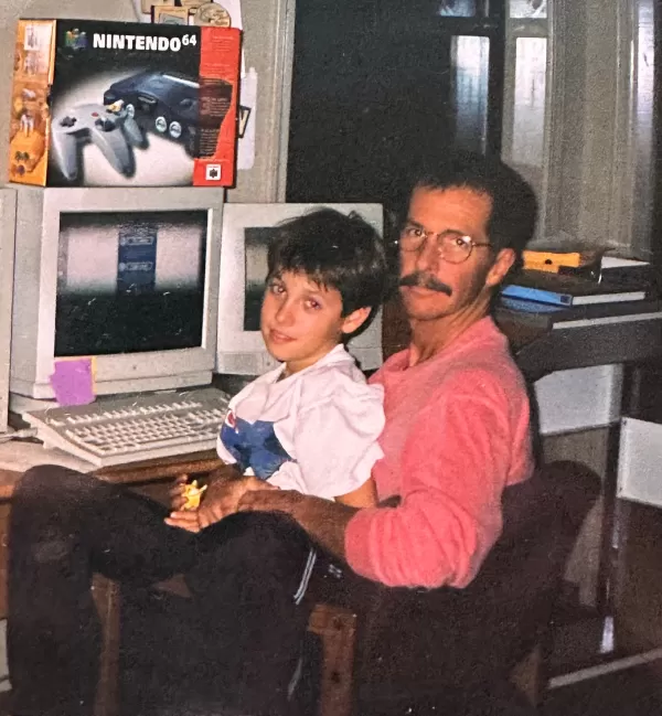
While continuing other Nintendo projects like redesigning the Atomic Purple N64 packaging, Maple maintained discretion about his Pokémon contribution—until recently. Now showcasing his work publicly for the first time at his family's urging, the designer reflects on accidentally shaping gaming history.
"I feel really...I feel good that I did the thing responsibly for them," Maple says of generations of Pokémon fans. His current work teaching art to underprivileged children has given new perspective on the logo's cultural weight—especially when students recognize their teacher designed the Pokémon branding.
As Pokémon approaches its 30th anniversary, Maple hopes for the opportunity to revisit his creation: "There is an energy and skeleton in there that deserves careful attention if modified." The crystal horse may be gone, but its coincidental witness to gaming history's making remains part of Pokémon's origin story.